———–
A logo can be brilliant and still fall flat the moment it lands on a business card that looks like it was pasted onto a beige rectangle. Clients rarely judge an identity by the vector file. They judge it by the scene: the letterhead, the envelope, the card resting on a desk. That scene is almost always a mockup, and small mistakes in it quietly tell viewers that the work behind it is unfinished.
Open almost any branding case study on Behance and you will notice a pattern: before anyone sees a color palette or a type specimen, they see stationery. Online printers such as Moo and Vistaprint rely on the same logic, showing customers a digital preview of their card before anything goes to press. A realistic scene builds trust; a clumsy one breaks it in seconds.
Mistake #1: Ignoring Real-World Proportions
Sizes are not a matter of taste
Stationery has standards, and experienced viewers feel it when they are broken. A US business card is 3.5 × 2 inches, while the common European format is 85 × 55 mm. An A4 letterhead measures 210 × 297 mm, and a DL envelope is 110 × 220 mm. When a designer squeezes a card layout into a mockup built for another format, the logo drifts, margins shrink, and the whole thing looks slightly "off" even to people who can't explain why.
Scale between items
The second trap is relative scale. A business card lying next to a letterhead should read as a small object beside a sheet of paper, not as a postcard. If the set looks like furniture from a doll's house, credibility disappears.
Mistake #2: Colors That Could Never Be Printed
Screen glow versus paper reality
Neon greens and electric blues look stunning in RGB, but CMYK printing can't reproduce many of them. Uncoated paper makes things even trickier, because ink soaks into the fibers and colors appear softer and warmer. Showing a vivid screen color on a matte card promises something the printer can't deliver. That is exactly why professional brand guidelines list Pantone references alongside CMYK and RGB values. Before placing your artwork, ask how it will actually behave on the stock you plan to use.
Finishes are part of the color story
Printers routinely offer matte, silk, and gloss stocks, plus extras like spot UV, foil, and letterpress. Each one changes how light hits the ink. A letterpress card has a soft, pressed-in impression; a gloss card throws sharp reflections. If the scene's finish doesn't match the print quote, the client will notice.
Mistake #3: Fake Textures and Lifeless Lighting
Quality scenes rely on smart objects, lighting layers, and texture overlays that make artwork sit inside the paper rather than float above it. The most common amateur giveaways include:
- Flat artwork with no shadow where the card meets the table
- Foil or embossing faked with a glossy gradient instead of a proper highlight map
- Identical paper grain on every item, as if the whole set came from one sheet
- Contradictory light sources on objects within one frame
- Oversized props (coffee cups, succulents, pens) that steal focus from the brand
Mistake #4: One Scene for Every Brand
Context tells the story
A law firm and a craft bakery should not share the same marble tabletop. The environment is part of the message: kraft paper and daylight suggest handmade warmth, while clean gray surfaces and crisp shadows speak of precision. Reusing one generic backdrop for every client makes a portfolio look like a template factory.
Build a set, not a single shot
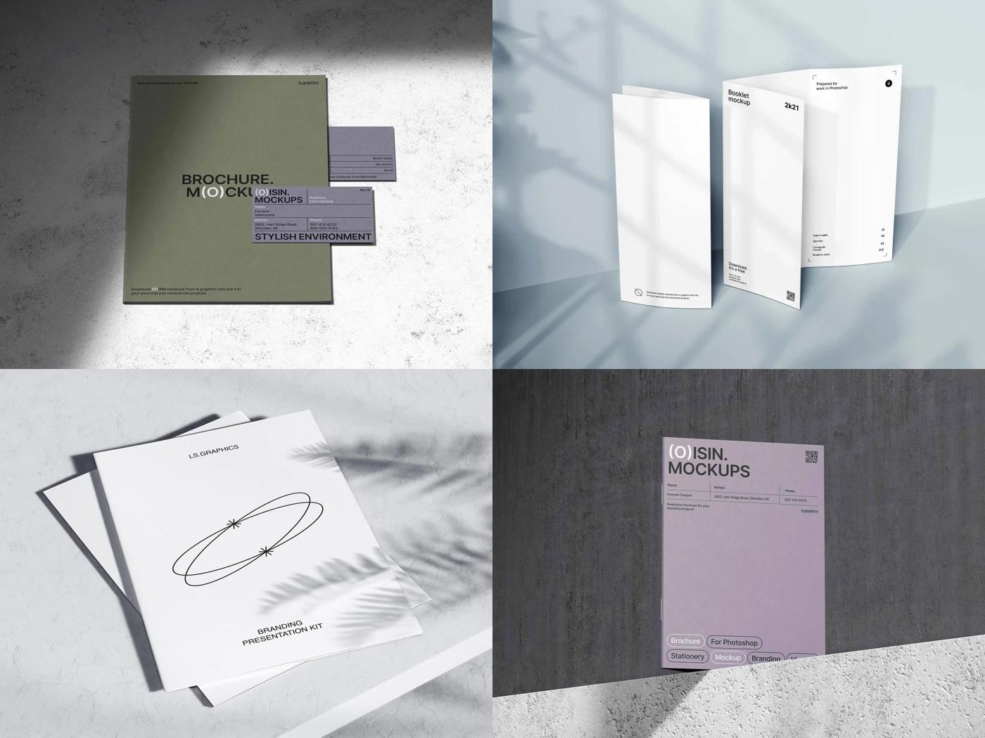
Clients want to see the system working together: card, letterhead, envelope, folder, maybe a notepad. Printers know this well: Moo's Printfinity option lets a single pack carry a different design on every card, which is why brands love showing several variations side by side. A well-chosen Stationery mockup collection lets you show that consistency from several angles without rebuilding the lighting each time. Resources like ls.graphics offer print scenes with editable backgrounds and believable paper behavior, so the brand stays the hero instead of the setup.
A Quick Pre-Flight Checklist
Five questions before you hit "Save"
Before a scene goes into a presentation, run a check. It catches most of the problems described above:
- Does the artwork match the real format of the item, including 3 mm bleed?
- Are the logo and images at least 300 dpi?
- Is every color printable in CMYK or Pantone on the chosen stock?
- Do all items share one light source and a believable scale?
- Is the copy real: actual names, titles, phone numbers, no lorem ipsum?
One "no" means the scene isn't ready.
From Pretty Picture to Proof of Quality
A stationery mockup is not decoration; it is a promise about how the brand will feel in someone's hand. Respect real sizes, pick colors that can survive the press, let light and texture do honest work, and match the scene to the personality of the brand. Get those details right, and your presentation stops looking like a template and starts looking like an identity ready for print.